Imagine waking up one morning and discovering that your Phone app something you use countless times a day has completely reworked itself overnight. That’s exactly what happened to many Android users this week. Without warning or an update prompt, Google rolled out a fresh, modern-looking redesign of the Phone (Dialer) app. While it may look sleek on the surface, the sudden changes have triggered a wave of user frustration. What exactly changed, why is everyone upset, and is there a way back? Let’s unpack it all.
What’s Different: The New Material 3 Expressive Design
Google’s update rebrands the Phone app with its Material 3 Expressive design, aiming for a smoother, more visually consistent experience but it comes with some bold shifts:
Key Changes at a Glance
| Feature | Before Update | After Update (Overnight) |
|---|---|---|
| Tabs Layout | Separate Recents and Favorites tabs | Unified Home tab showing both Recants and Favorites. |
| Keypad Placement | Floating Action Button within tab | Dedicated middle tab with rounded, oversized buttons. |
| Contacts Access | Tab at bottom | Hidden in navigation drawer via search bar 9to5Google |
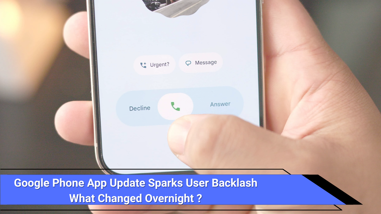
| Call Answer Method | Simple tap-to-answer | Horizontal swipe like iPhone; but tap still optional. |
| In-Call Controls | Standard buttons | Pill-shaped controls with a glaring red End Call button. |
Many users, accustomed to their muscle memory, were thrown off by design adjustments that felt unnecessary or worse, unsafe in urgent situations.
Why Users Are Frustrated
- Surprise Factor: Most users didn’t opt into the change it just appeared. That “overnight” adjustment made the experience jarring.
- Cluttered Layout: What was once clean and efficient now feels busy. Oversized buttons and rearranged elements broke the ease of navigation.
- Disrupted Muscle Memory: Tapping or swiping at familiar icons now leads to unexpected actions, slowing down users during important moments.
- Aesthetics Over Usability?: Some critics argue Google prioritized the look over functional comfort. “Visual updates over usability,” one user noted clearly voicing widespread sentiment.
- Red End Call Button: While brighter, some find it jarring particularly in low-light or hectic contexts.
Real-User Voices (from social media):
“The phone app used to be perfection. Now the buttons are blocky, oversized, and ugly.”
“What an ugly design for a phone dialer. Please change and bring back the old one.”
And on Reddit:
One user described the new design as “so trash” though others defended it, saying bigger buttons are easier to press. Some pointed out that parents or less tech-savvy folks now struggle to adjust Reddit.
How to Get the Old Look Back (For Now)
While there’s no official rollback option from Google, a few workarounds exist:
- Use Tap-to-Answer Instead of Swipe
- Go to Settings – Incoming Call Gestures and switch from swipe to tap. This helps restore part of your muscle memory.
- Uninstall Updates
- Open Settings – Apps – Phone, tap the three-dot menu, choose Uninstall updates. This restores the version that came with your phone.
- Then disable auto-updates for the Phone app in the Play Store to hold onto the older layout.
- Use Alternative Dialer Apps
- Especially for OnePlus, Oppo, Realme users, the ODialer app on Play Store mimics the older interface.
- Other third-party dialers are also available if you prefer a familiar layout.
Note of Caution: Holding onto older versions may leave your app missing security fixes or improvements.
Pros & Cons of the New Layout
- Pros
- Modern aesthetic in line with Android’s overall Material 3 redesign.
- Larger buttons may aid visibility and reachability especially on larger screens.
- Swipe-to-answer can reduce accidental pocket calls.
- Cons
- Learning curve disrupts habitual workflows.
- Distracting red End Call button feels prominent in normal use.
- Hidden Contacts menu adds extra navigation steps.
- One-size-fits-all design may clash with embedded workflows.
Timeline: How It All Happened
| Date | What Happened |
|---|---|
| Mid-June 2025 | Material 3 Expressive redesign started testing internally. |
| Aug 21, 2025 | Public rollout began with version 186 for stable users. 9to5Google |
| Aug 22–23, 2025 | Users woke up to the new app unexpectedly, sparking immediate backlash. Social media buzz grew. Memes on X and Instagram started circulating. |
| Aug 26–27, 2025 | News outlets and guides surfaced with instructions for disabling or rolling back the update. |
What This Means for Users
For many, phone apps aren’t just tools they’re trusted routines. When those routines are reshaped abruptly, users feel disoriented. From grandparents to emergency calls, every tap or swipe should be reliable.
Design is more than looks. Comfort, clarity, and consistency matter especially in something as integral as making a call. The backlash here isn’t about nostalgia it’s about usability.
Conclusion
Google’s overnight overhaul of the Phone app stirred genuine frustration. While the Material 3 Expressive interface aligns with Android’s modern aesthetic, it disrupted ingrained habits, cluttered familiar workflows, and left many scrambling to adapt. If the update feels uncomfortable, you’re not alone and there are ways to ease the transition:
- Try switching back to tap-to-answer.
- Uninstall updates (with caution).
- Use alternative dialers if needed.
Sometimes, change can be good—but not when it happens without warning. Hopefully, Google will take this feedback seriously and strike a better balance between fresh design and user-friendly familiarity.
Check out our related article on high-speed mobile gaming on a budget: High-Speed Gaming on a Budget: Infinix GT 30 5G hits Indian market.


Nand Kishor is a content writer covering business, economy, and world affairs. With a background in journalism, he focuses on clear, ethical, and insightful reporting. Outside of work, he enjoys chess, cricket, and writing short stories.